A Brief Look at Some Traditional Western Calligraphy Scripts
Western calligraphy has over 2000 years of history. The flow of politics, economics and inventions through the ages have influenced the development of calligraphy in different ways, in various parts of the world. It can be a complicated study to draw clear boundaries of definition and time periods around each script, or to trace how their variants developed. Different sources classify and trace a script’s development in different ways. This short article is, therefore, by no means definitive. It aims only to show some of the more influential scripts against a rough timeline.
ROMAN CAPITALS
The Latin alphabet dates to around 600 BC. Around the first century AD, the Roman Capitals emerged. The Roman script is arguably the most influential historical script by far. Its beauty lay in its geometry and precision, reflecting the amazing architecture of that era. Today, the Roman Capitals are produced using flat brushes or nibs.
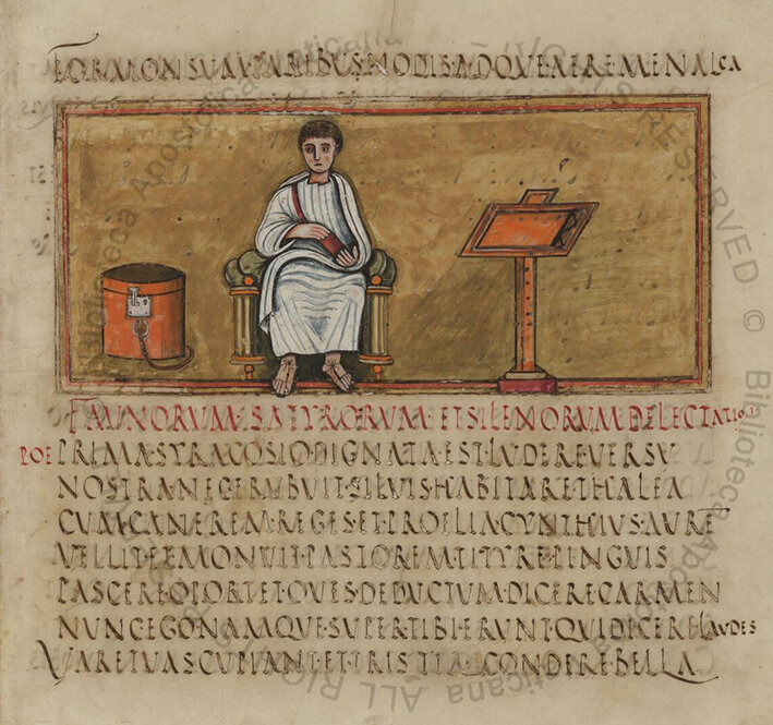
A page of the Virgilius Romanus, 5th century
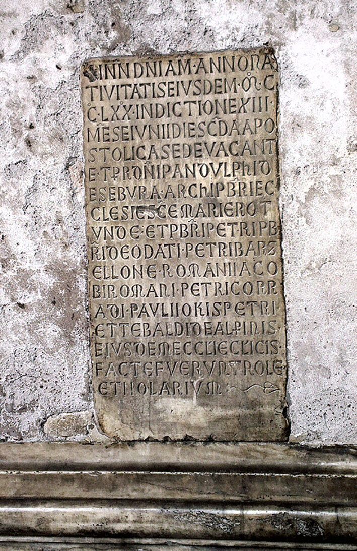
Roman capitals carved in stone on a wall outside the Pantheon in Rome. (Photo by Dorothy Lim-Chew)

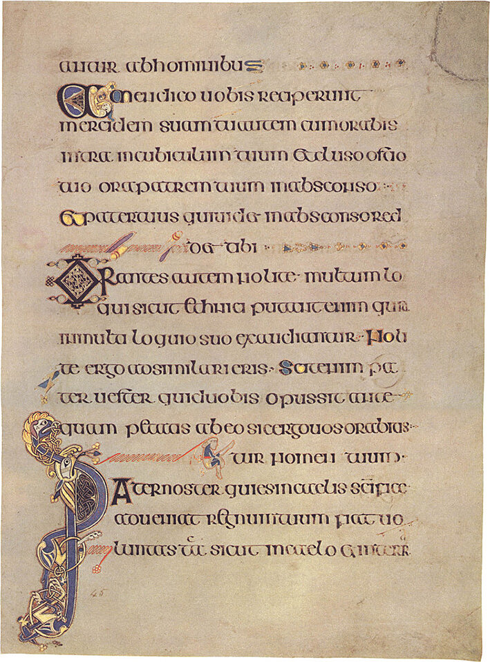
Folio 27r from the Lindisfarne Gospels (c.700) contains the incipit from the Gospel of Matthew
UNCIAL
The Uncial script developed in the second or third century AD, influenced by the Greek alphabet. This script is characterised by bold and curved strokes, and was simpler than the Roman capitals, allowing for speedier writing, ideal for copying manuscripts such as holy scriptures. Christian churches promoted the development of this writing through prolific copying of the Bible and other sacred texts.
A folio from The Book of Kells, Matthew 23:12-15, Folio 99 Verso (c. AD 800), lettered in a script known as "insular majuscule", a variety of the Uncial script
CARONLINGAN
Variations of the Uncial scripts developed as its influence travelled to other parts of Europe. An important script of the medieval era was the Carolingan script developed during the reign of Charlemagne in the late 8th century. While in England, the Insular script developed and spread across England and continental Europe.

Page of text (Folio 160v) from a Carolingian Gospel Book (British Library, Add MS 11848), written in Carolingian minuscule. Text is Vulgate Luke 23:15–26
GOTHIC
Around the 12th century, the Gothic script developed in northern Europe from the Carolingian hand. This style, characterised by compressed thick, angular strokes and shapes, is very popular today and different variations of it are practiced by calligraphers. Among the variations are Textura, Lombardic Capitals, Batarde and Fraktur.


Gothicized italic, a modern take by Nina Tran, 2020
ITALIAN & HUMANIST
In Italy, however, the Gothic script was considered rather unpractical and fatiguing to the eye. Thus the Humanist minuscule was favoured. This script was influenced by the Caronlingian hand and arose around the 15th century.

Page from the Book of Hours of Giovanni II Bentivoglio, Bologna, c. 1497–1500. Humanist minuscule with colored versals and decorations
Scholars, dissatisfied with how laborious the Humanist minuscule was, created a slanted script that required fewer strokes, and could be joined to other letters. The Chancery hand (and later, the Chancery Cursive) was innovated, to allow greater speed of writing. This script serves as the basis for the cursive writing we use today.

A page from La Operina by Ludovico Vicentino degli Arrighi (1475–1527), in the chancery style

Italic by Eleanor Winters, 2014
Handwritten books went into decline after the invention of the printing press by Gutenberg. Western calligraphy revived at the end of the 19th century with the Arts and Crafts Movement in England.
FOUNDATION
At the start of the 20th century, Edward Johnston rediscovered how the formal bookhands of the ancient illuminated manuscripts had been written using square cut quills which produced thick and think strokes with even pressure. Johnston advocated that developing an upright roundhand was an essential. Thereafter, the penman can adapt and develop it to a sloping or angular hand with ease.

From ‘The House of David’ (1916) Johnston uses the term Foundational Hand to define this script
ROUNDHAND & COPPERPLATE
During the 17th and 18th centuries, English writing masters Geroge Bickham, George Shelley and Charles Snell popularised Roundhand's popularity, so that by the mid-18th century this style had spread across Europe and crossed the Atlantic to North America.

George Bickham’s Roundhand script, from The Universal Penman, c. 1740–1741
In the 18th century, the development of metal plate-engraving and the rise of a business class gave rise to the importance of the Copperplate script.
As education flourished, writing schools were established where people could learn penmanship. Masters seeking pupils created print advertisements – often beautiful and elaborate pieces of art. These masters produced copybooks from which students could learn by copying the master scribes. These books were produced by craftsmen who engraved the works of master scribes onto copper printing plates by scribing fine lines using a sharpened steel tool called a burin. The name “Copperplate” derives from this engraving method.
The shapes of the letters were influenced by the printing method. This led to changes in letterforms – curves became rounder, letter slant increased and contrasts between heavy and fine lines were more pronounced.

A fine example of Copperplate script by Horace G. Healey
Today, the term “Copperplate” is used to refer to shaded scripts written with a pointed, flexible nib. Of this, many variants exist, such as Engrosser’s script, Madaraz script, and Italian Hand. Modern calligraphy is often a derivative of this.
SPENCERIAN
Also worth noting is the Spencerian script, which flourished in the United States in around the mid-19th to 20th century. Named after Platt Rogers Spencer, it is a flowing oval-based script that could be written quickly and legibly. Taught in the school Spencer started specifically for to teach the script, Spencerian eventually became the standard writing across the USA until the invention of the typewriter made handwritten correspondences obsolete.

An example of Spencerian script (1884)
PRESENT
Today, interest in calligraphy is enjoying a resurgence with the demand for personalisation, the handwritten word and hand-crafted quality. As you view the artworks in this exhibition gallery, you might see some of the influences of these traditional or antique scripts. Though modern calligraphy tools have come to replace antique ones, present-day calligraphers remain sensitive to the influence of the disciplined letterforms and stylus of this centuries-old art form.